How Bad User Interfaces Make Security Tools Harmful
User interface design is one of those often overlooked aspects in software design in general. A bad user interface can quickly become a vulnerability regarding security. Even though I do not remember actual CVE's assigned to bad user-interface design, there probably should be some. One of the more famous user interface design issues was the "Therac-25" radiation treatment device. A bad user interface has been blamed for contributing to some deadly accidents [1].
The issue I am considering here is that it is unlikely to kill someone. Still, they need to make it easier for regular users and security professionals to identify problems accurately and adequately respond to security incidents. I am not naming/shaming any specific products here. The examples shown are representative for pretty much any current consumer security tool.
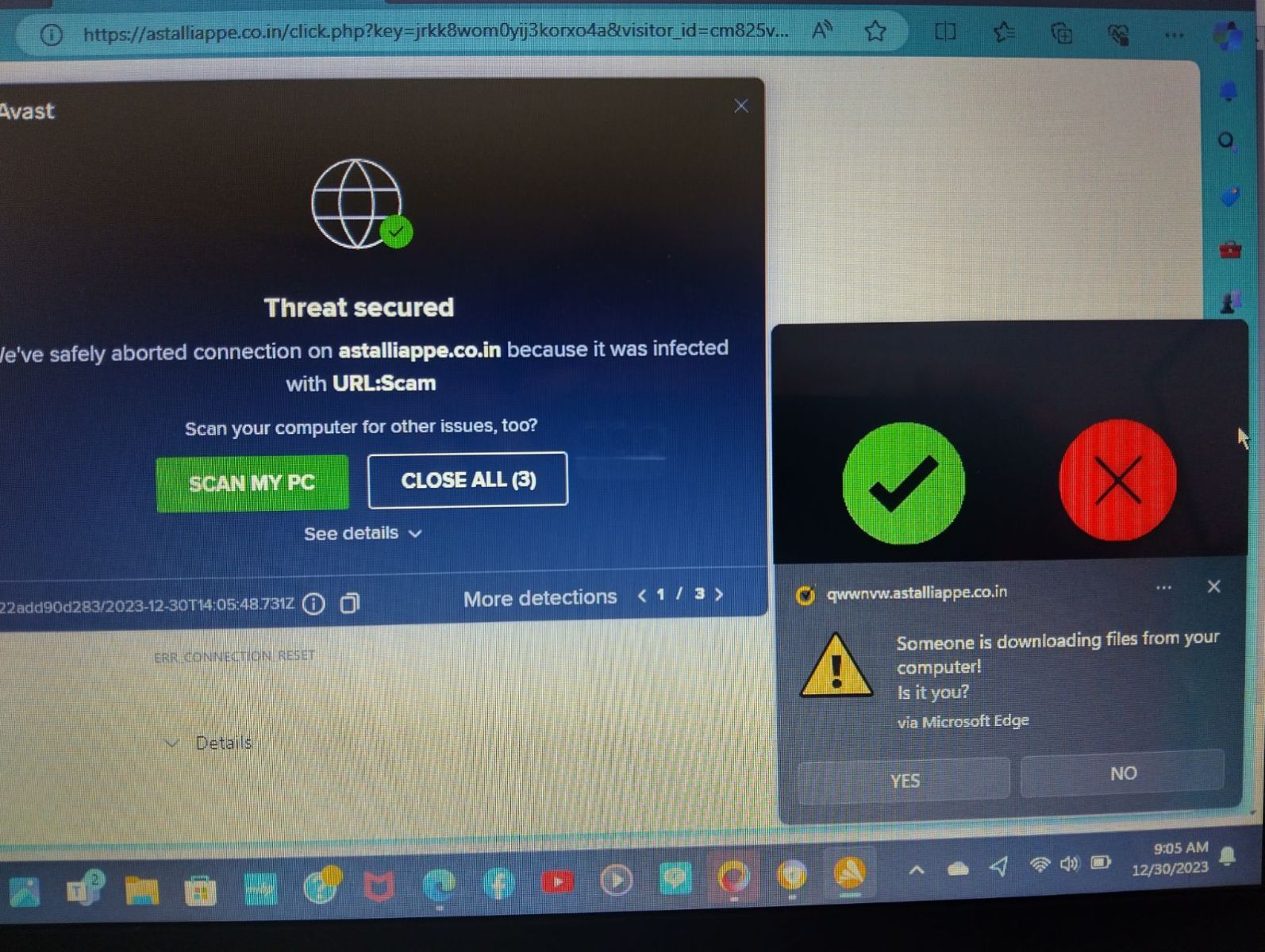
Like many of our readers, I often receive requests for help from family, friends, and neighbors. Here is a typical screenshot I received from one:
For this post, it is good to have these "mobile phone screenshots." It shows what messages the user considers important. How long did it take you to find the real anti-malware message among the fake ones? The user clicked on the wrong one, leading to a fake tech support line. Luckily, the fake tech support company asked for more money than the user could pay. However, the victim still had additional malware installed on the system.
Security companies, in particular in the consumer space, often use popup notifications as a sales tool to convince users of the value of the product. I remember the early versions of the Windows firewall "Zone Alarm". For each rejected packet, it showed a popup notification. Of course, this quickly became too annoying as bots started to proliferate.
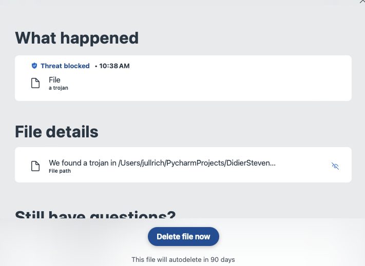
This isn't just an issue with one particular product. All are the same. The popup is also often not useful enough for a more skilled server to understand what is happening. For example this popup from a different product:

The popup above is from an Anti-Malware product I am running on my system. The filename is cut off, and I have not found a way to get the full path/filename. Instead, I am left guessing if this is a false positive or real malware. In this particular case, some of you may recognize the name in the path, and this gave it away to me why the alert popped up. But in particular, in cases where the malware arrived as an email attachment, it will be in a "random named" folder, and little is displayed about what the malware is about and what it would do if executed.
As a consumer, we need fewer alerts. I do not need to know that a particular attachment is malicious unless I try to execute it. Same for websites. You can just block access to the site. By the time the fake popups show up, your product failed. Security companies need to invest more in better user interface research to communicate threats to users of various skill levels accurately and effectively.
Most requests for help I get from non-technical users are for false positives and fake attacks, not actual infections. And for the remaining real infections, they are often caused by these users falling for a fake alert and trying to do the "right thing".
[1] https://en.wikipedia.org/wiki/Therac-25
---
Johannes B. Ullrich, Ph.D. , Dean of Research, SANS.edu
Twitter|

.jpeg)


Comments